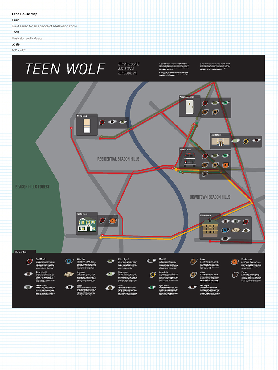
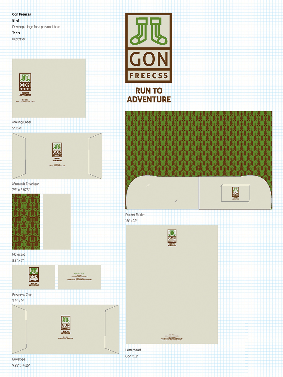
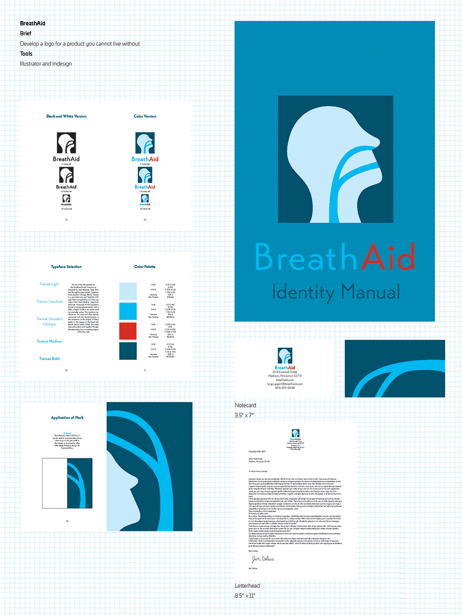
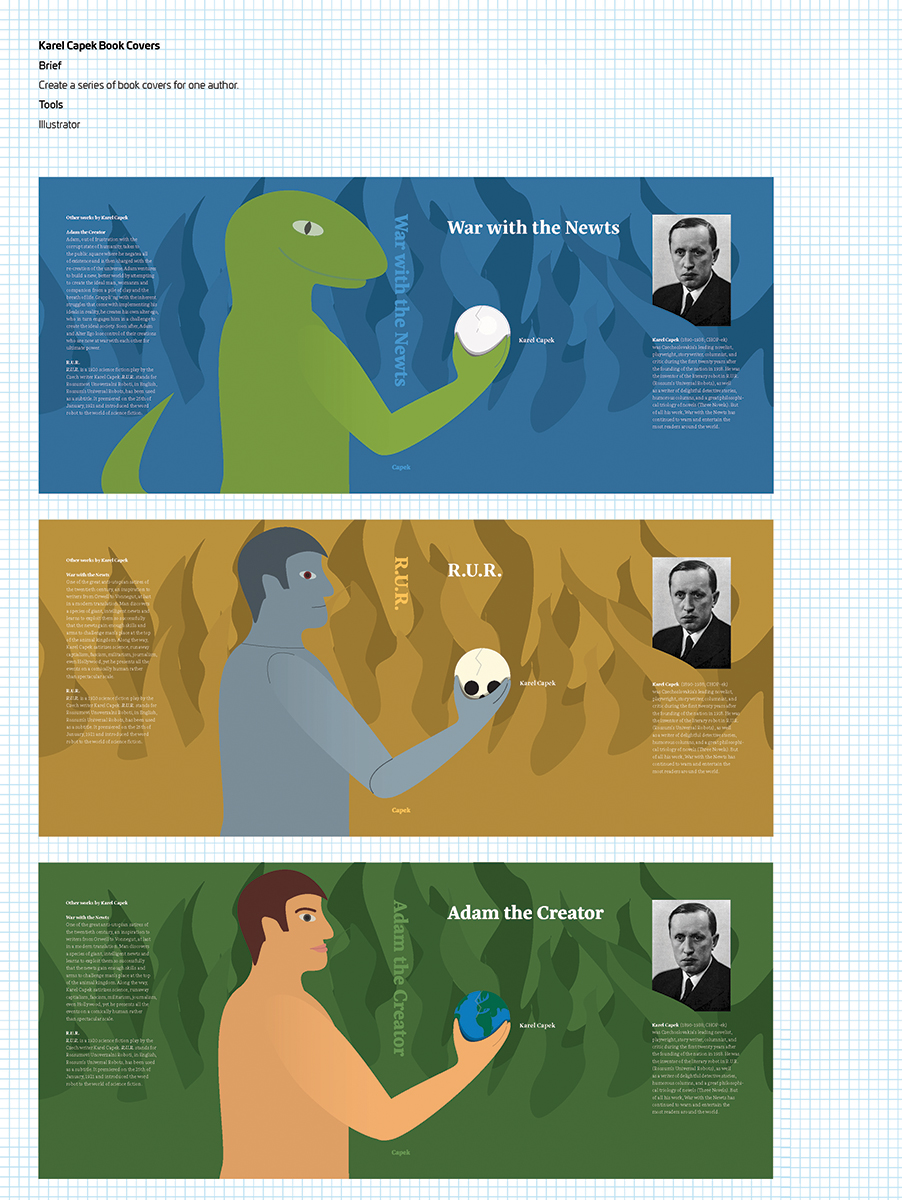
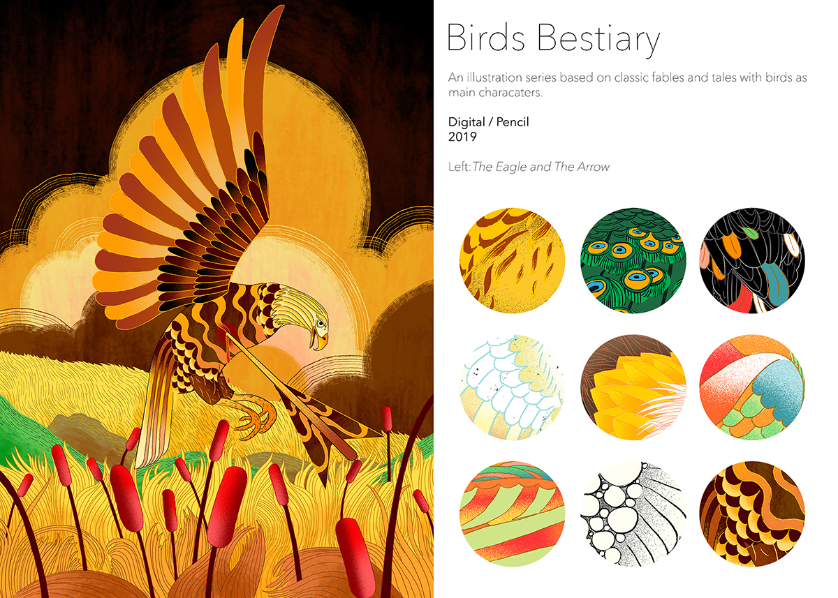
The annual University of Wisconsin-Madison Art Department Bachelor of Fine Arts Senior Exhibition presents the refined art portfolios of our new Class of 2020 cohort of BFA graduates and experts in creative problem solving, visual communication, teamwork and collaboration, and project management!
Requiring a number of studio and aesthetic courses in preparation for their careers as professional artists and/or for graduate study, the BFA program provides students the opportunity to specialize in areas such as ceramics, drawing, glass and neon, graphic design, papermaking, performance, photography, and more, harnessing and nurturing their creative energies to develop the critical and artistic skills needed to excel in contemporary multidisciplinary practices leading to influential and rewarding careers in art and design.
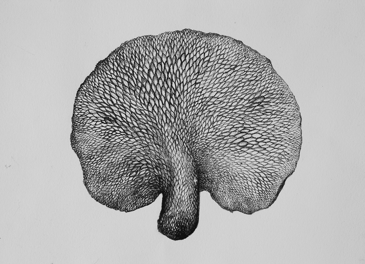
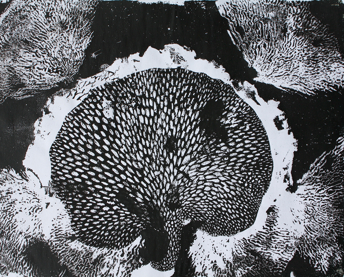
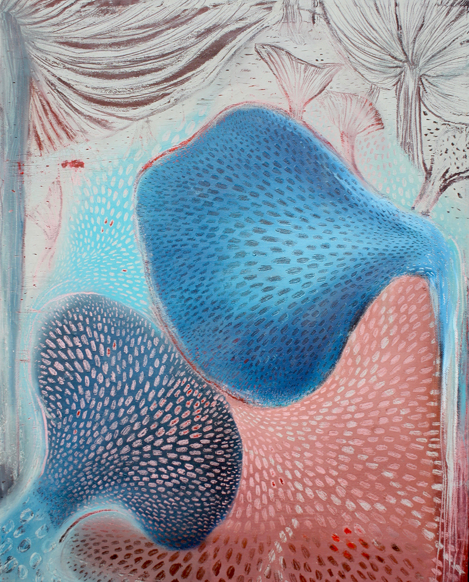
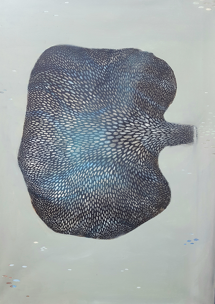
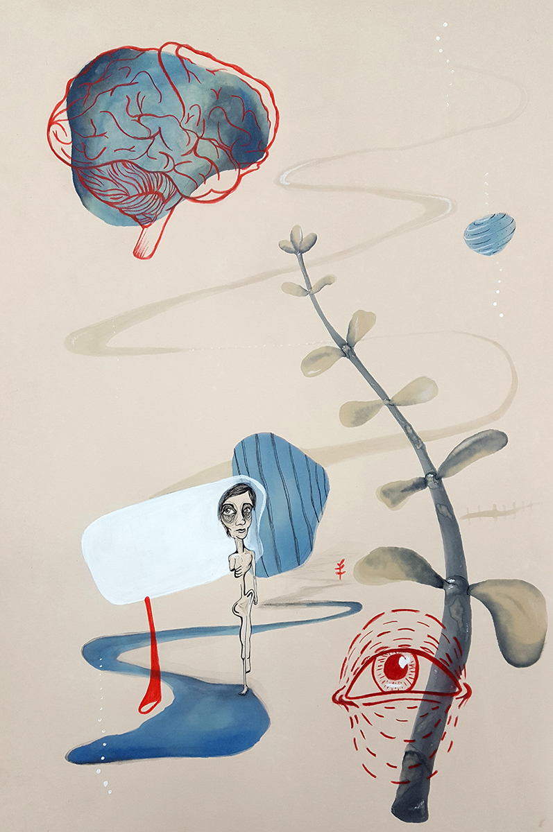
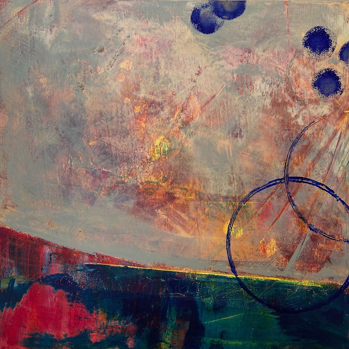
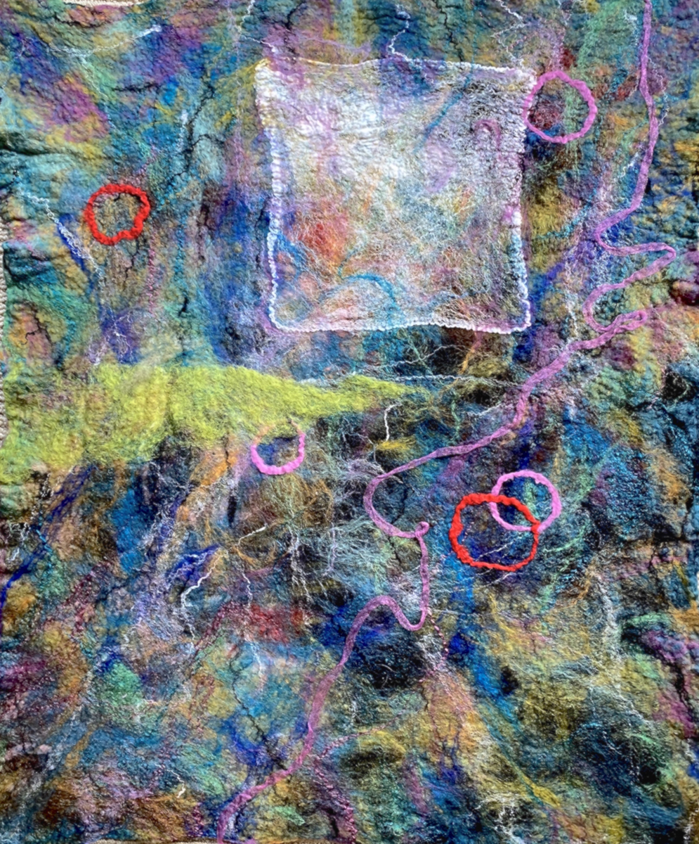
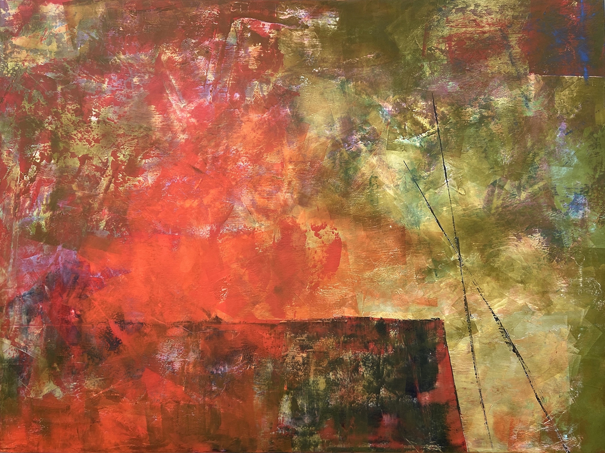
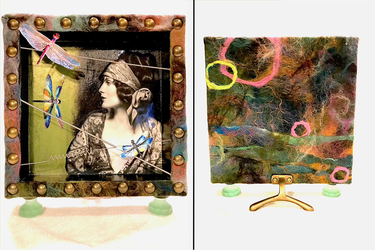
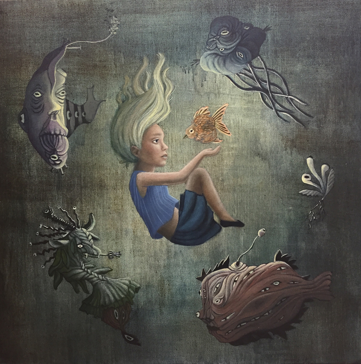
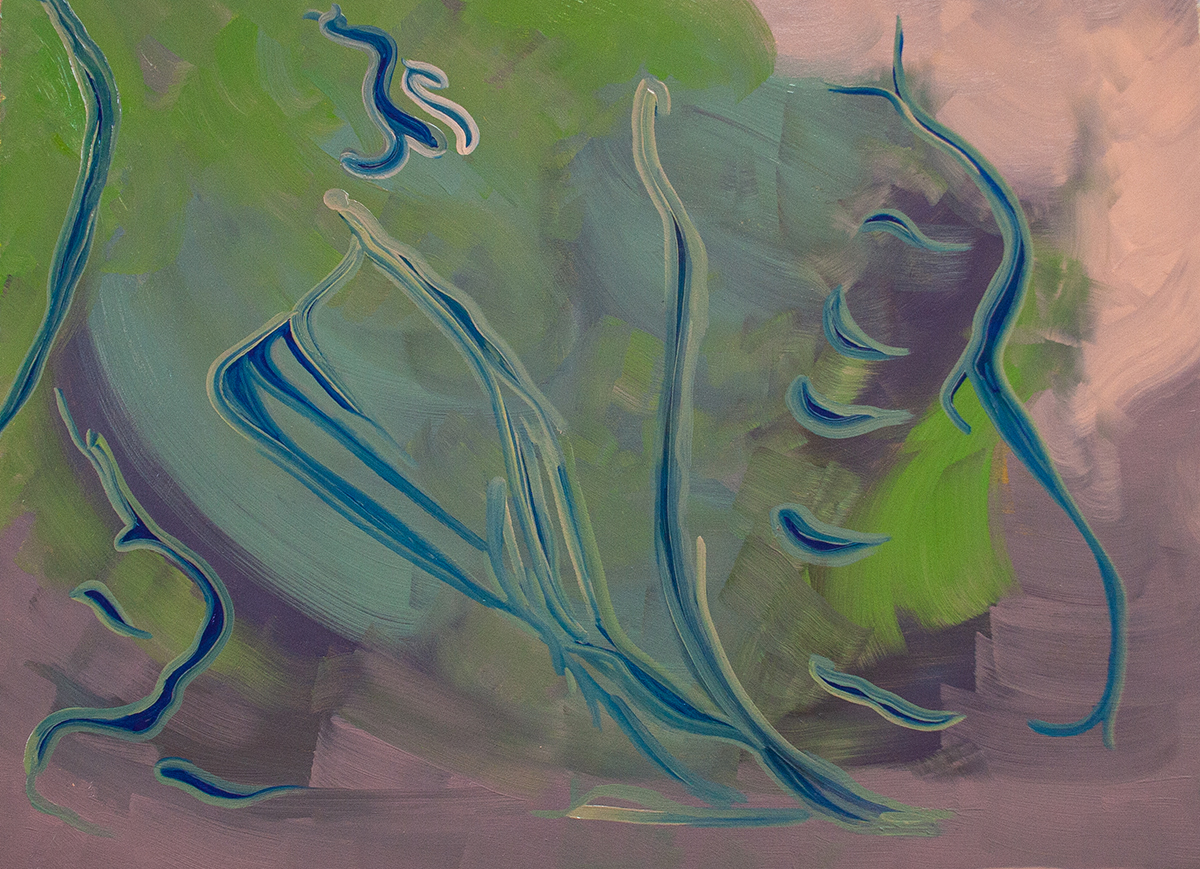
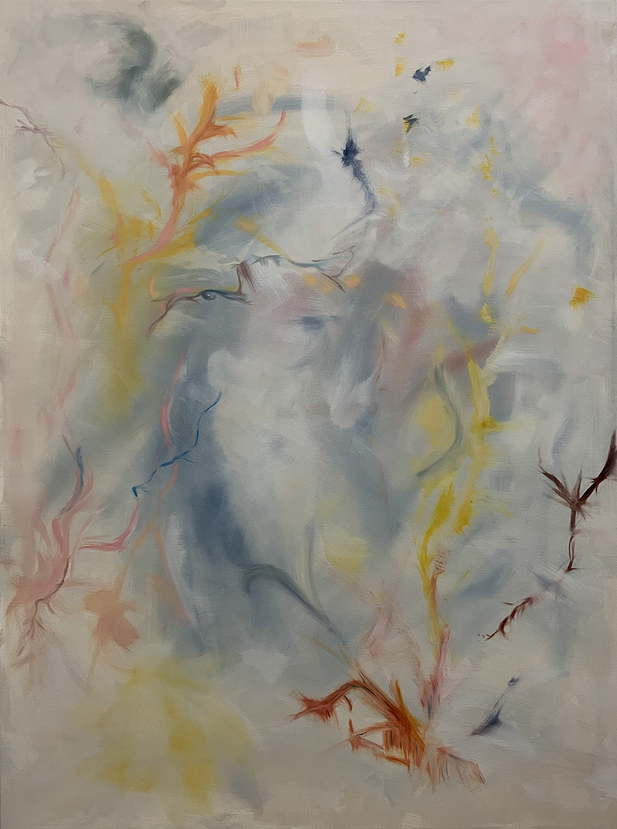
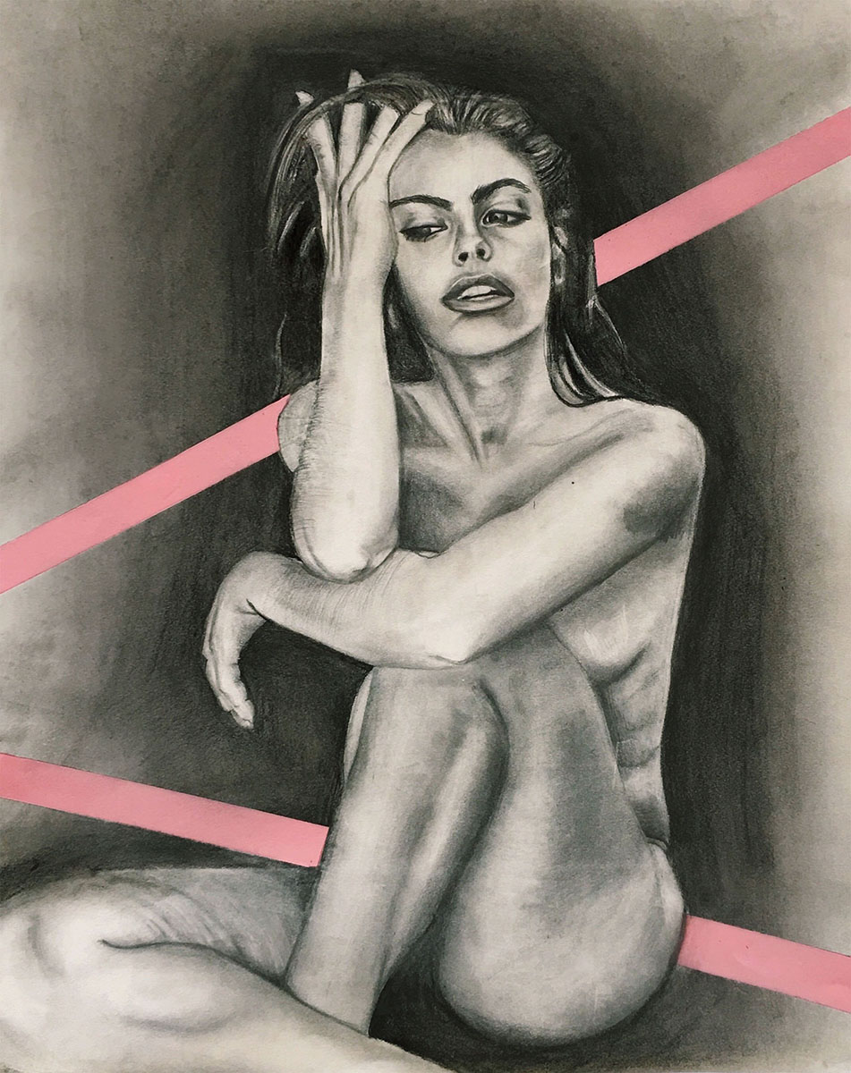
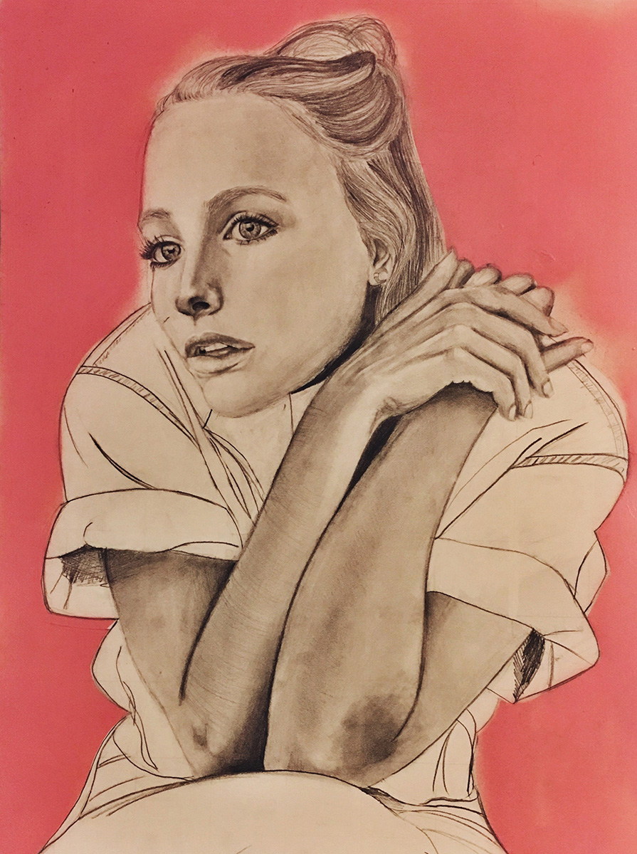
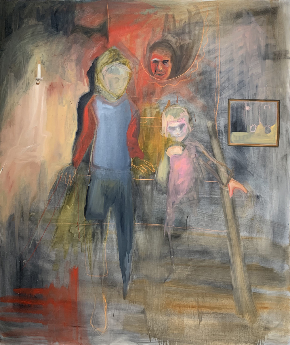
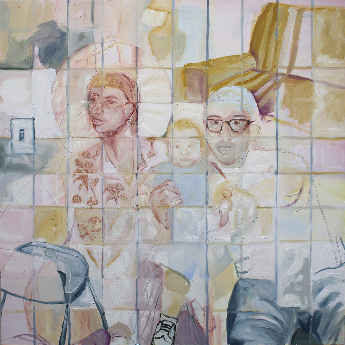
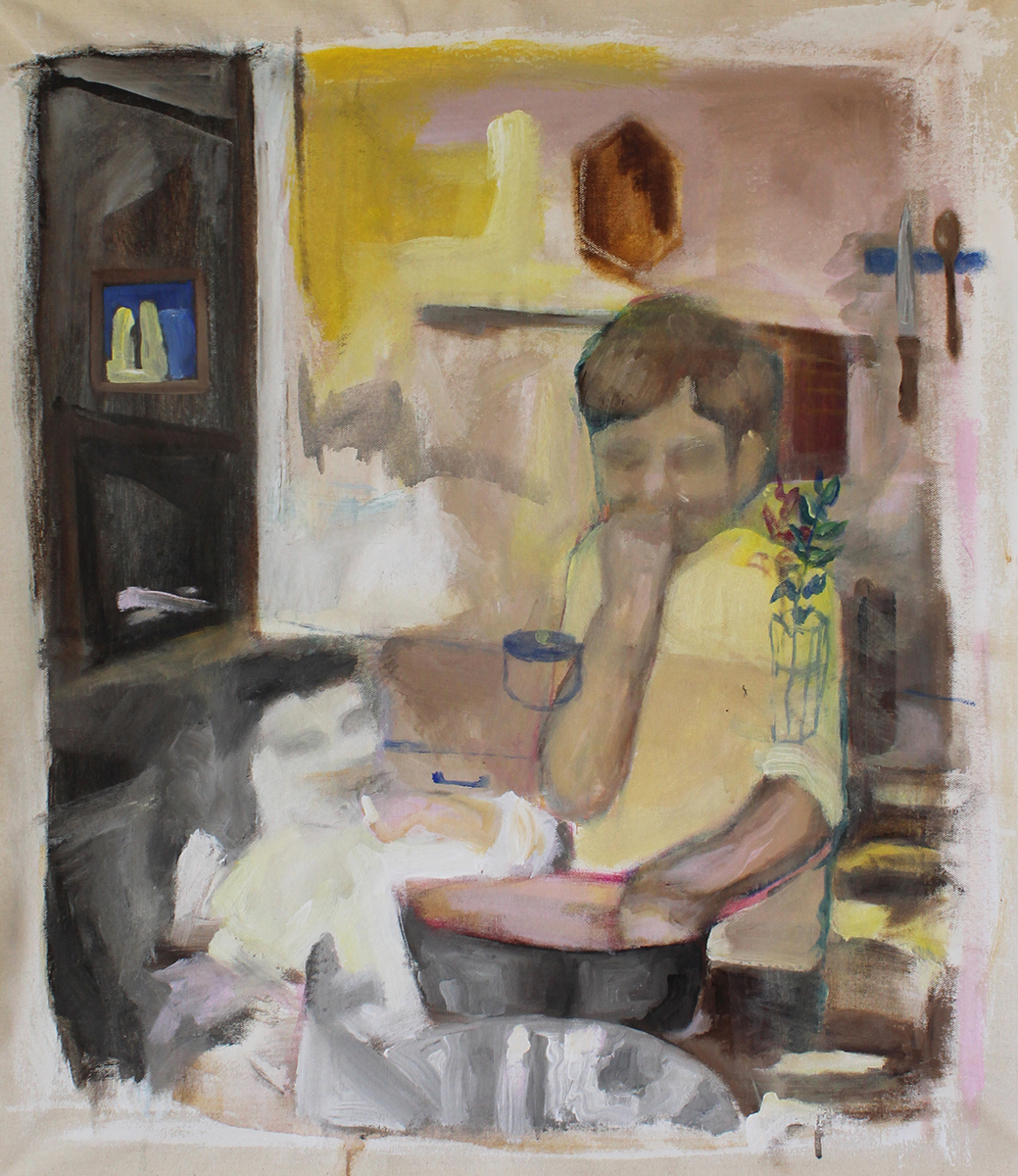
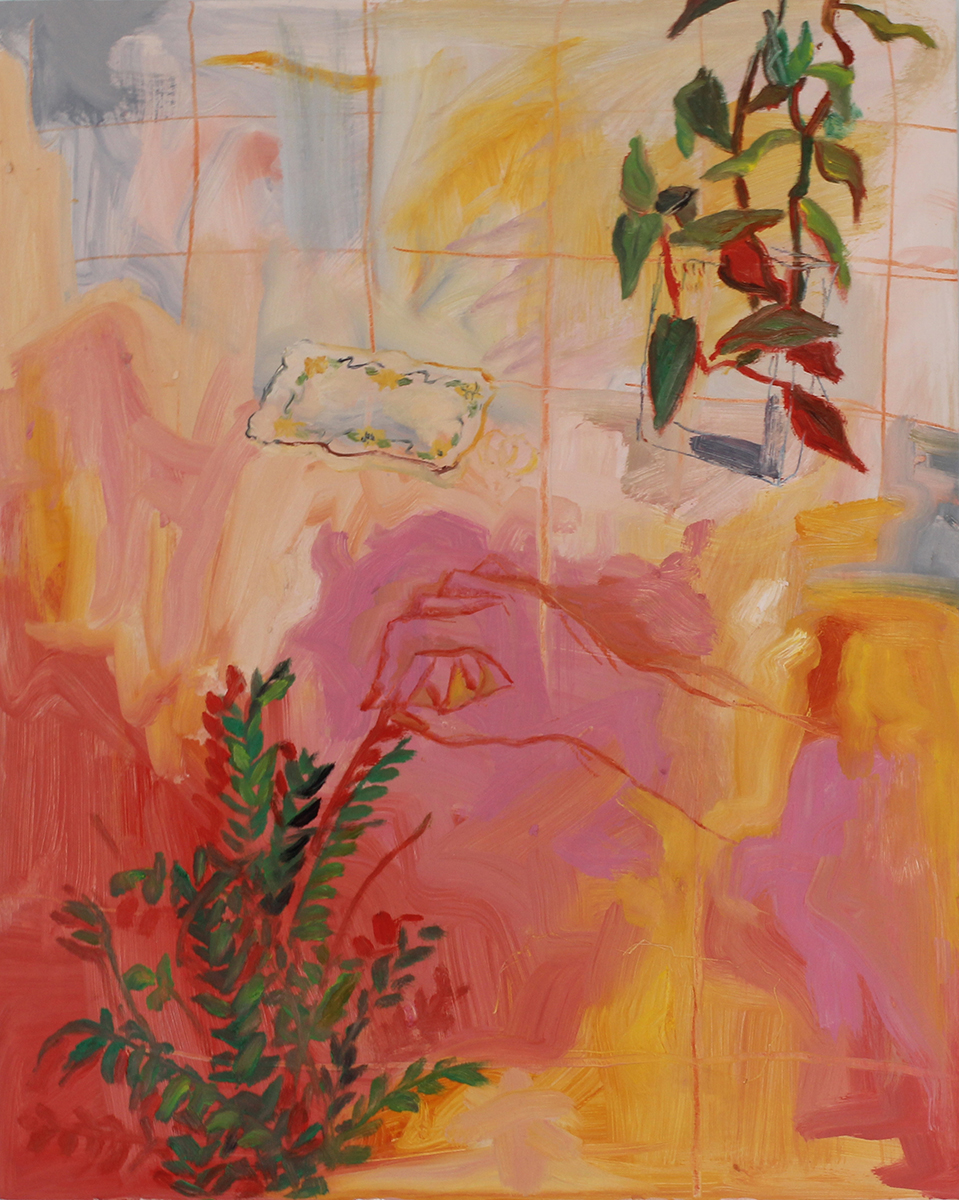
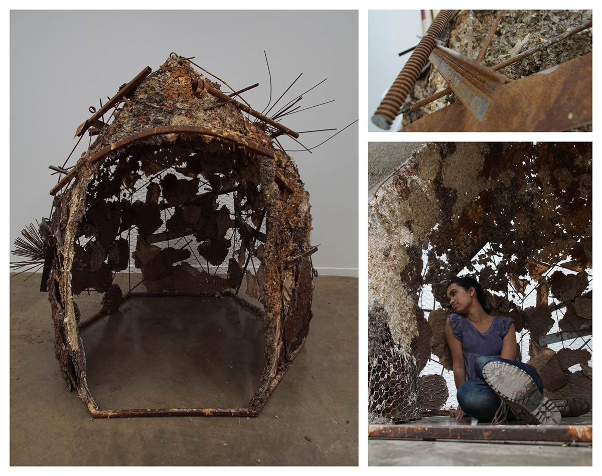
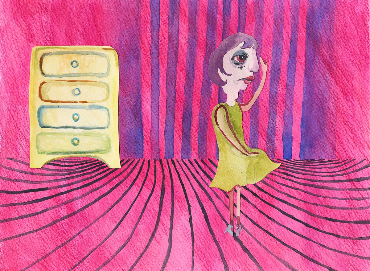
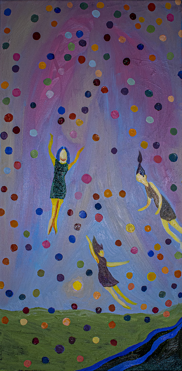
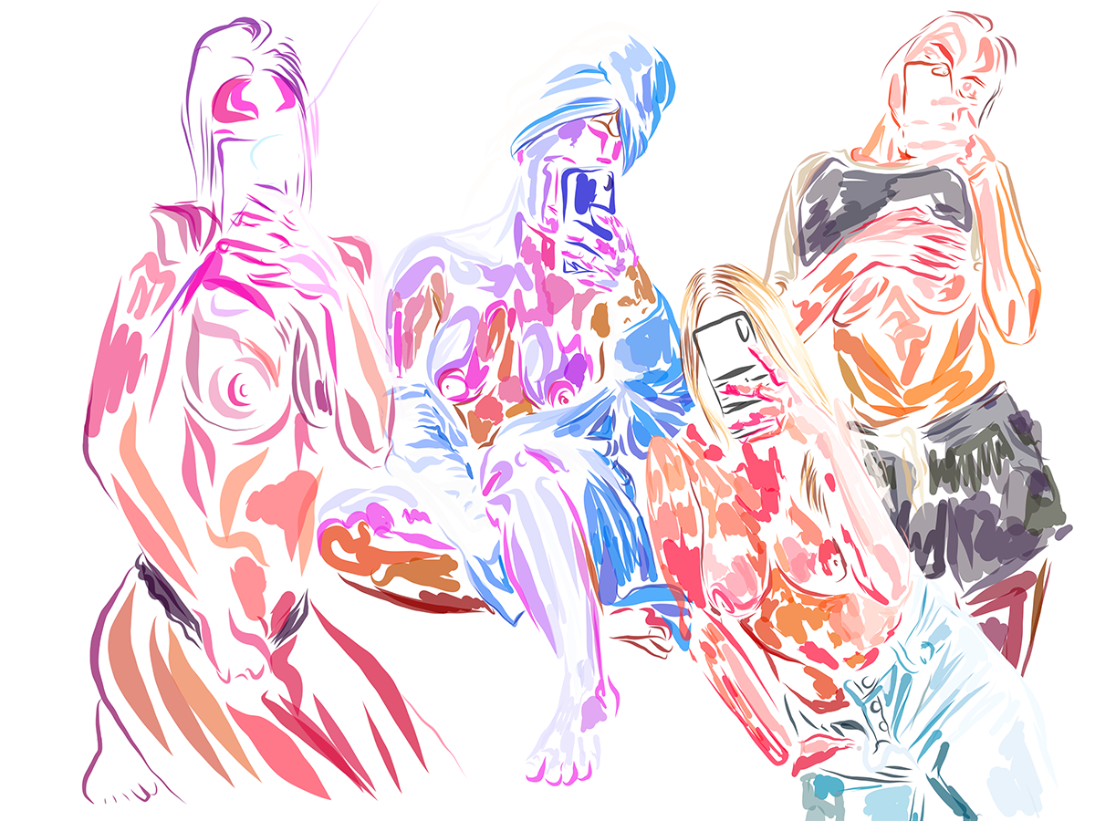
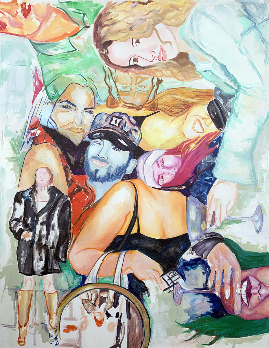
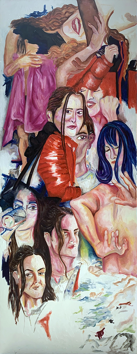
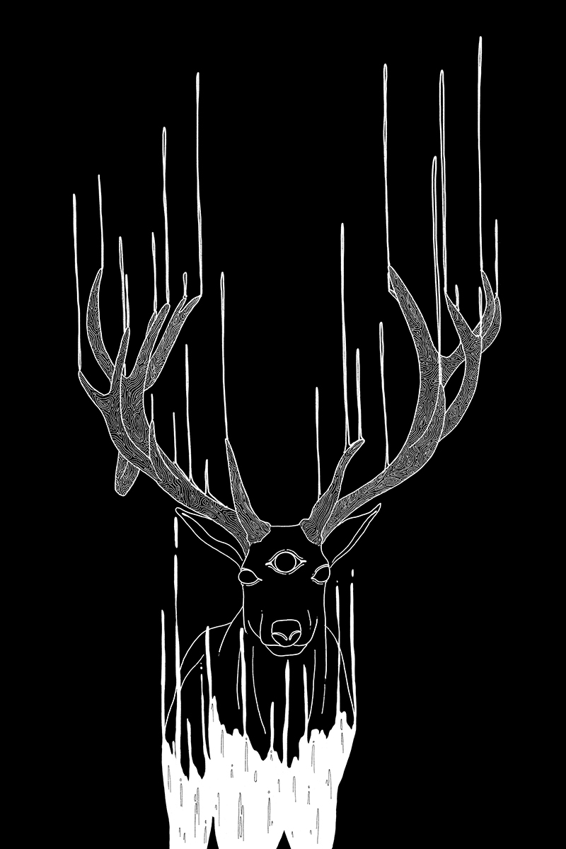
Elizabeth Shaw Neviaser
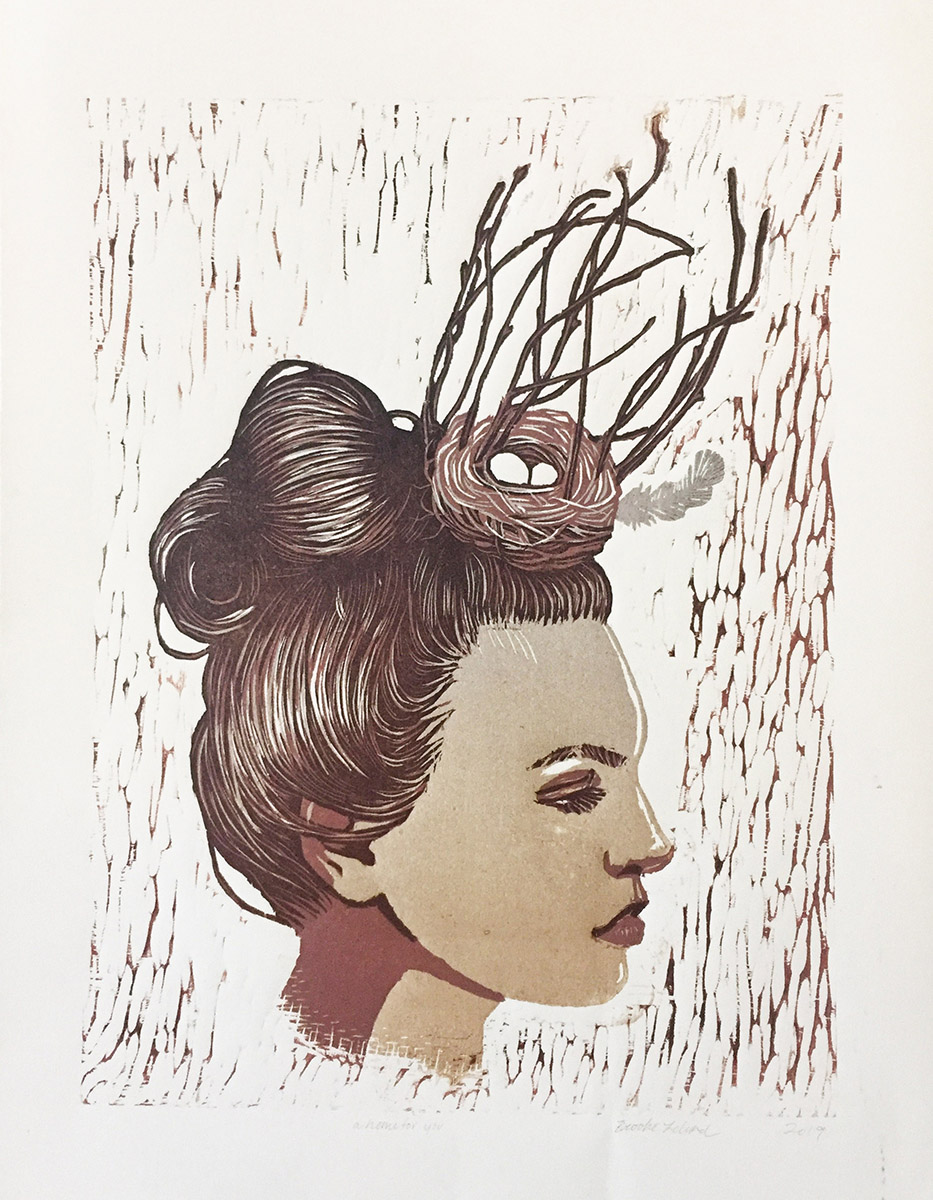
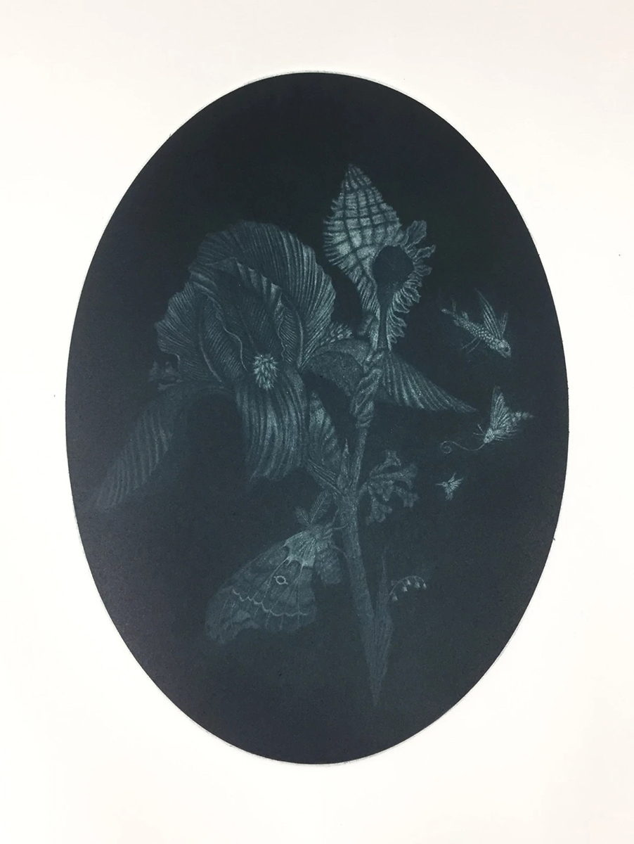
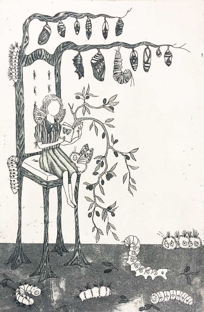
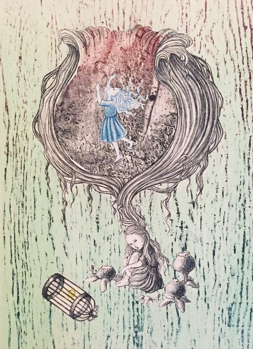
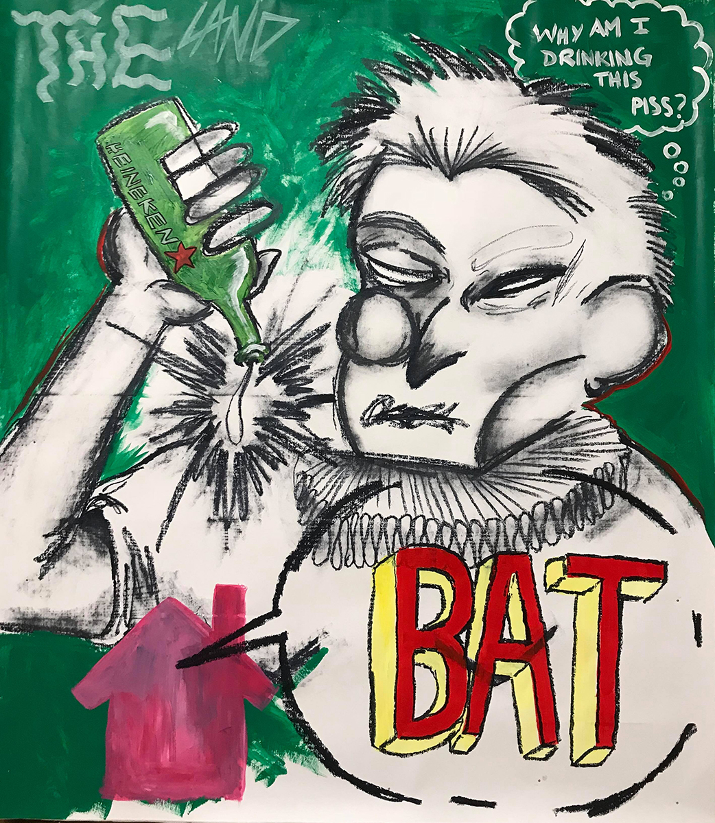
In her thesis Foundations of Forgiveness, Shaw Neviaser consciously and subconsciously documents her changing views on human nature and society, from an originally grim outlook to seeing the best in people.
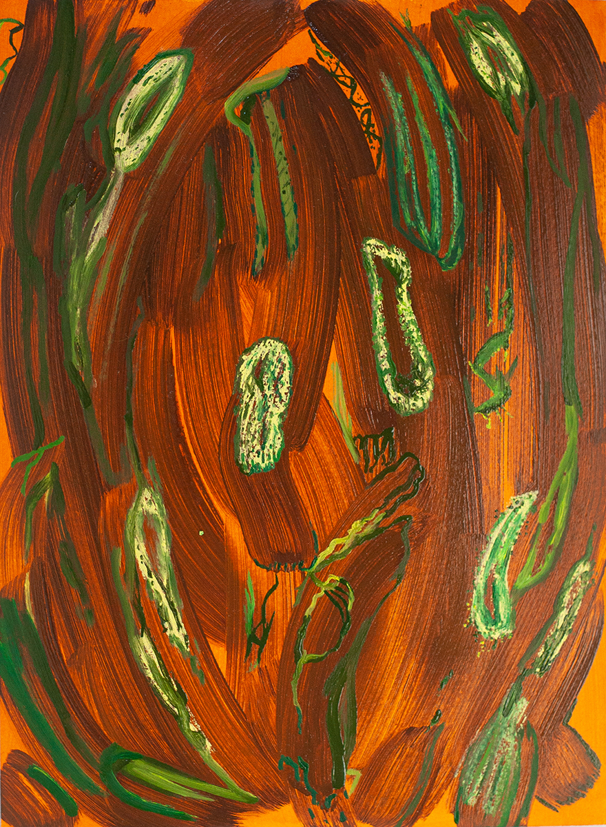
Kara Morris
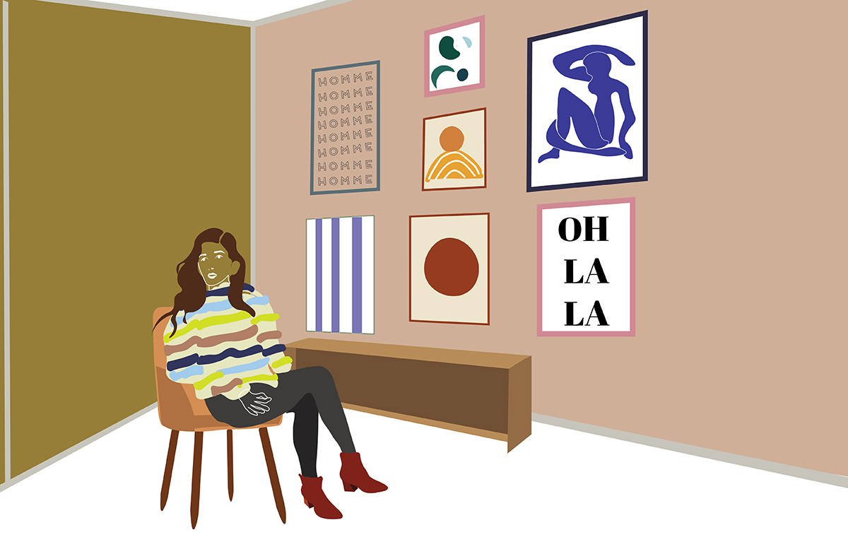
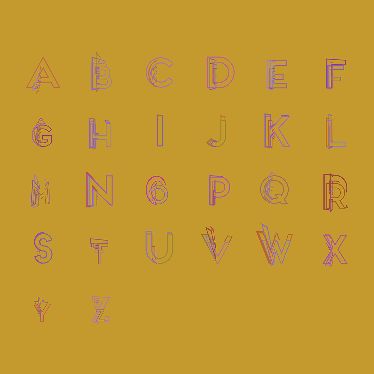
Morris’ design is driven and shaped by curiosity regarding the function of an audience, challenged to understand the impact of her work and applying her style to fit the desired outcomes of a project. She is pushed creatively by the opportunity to solve design problems, capturing the essence of a subject matter through typography, color, and style in order to make a strong, effective impact on the viewer. Morris seeks to build a comprehensive perspective on messages and environments, and transform that information into visual communication rich in emotion and purpose, exploring communication and purpose through the creative design process.
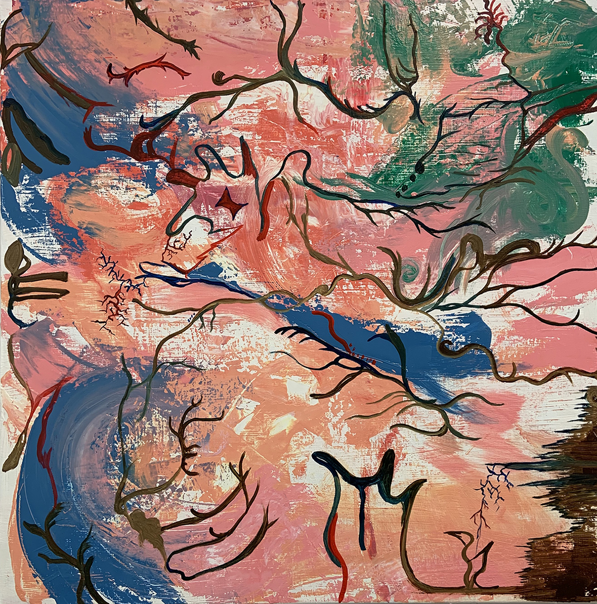
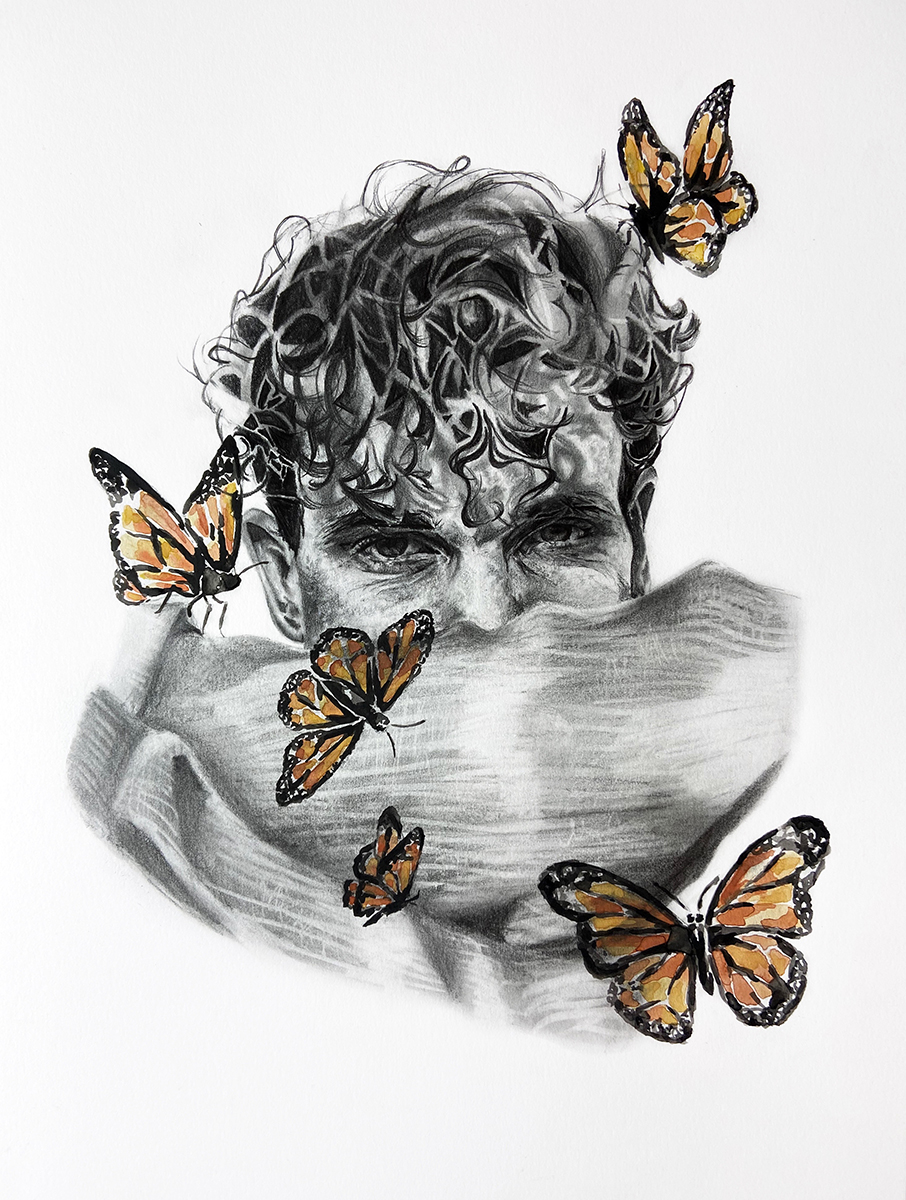
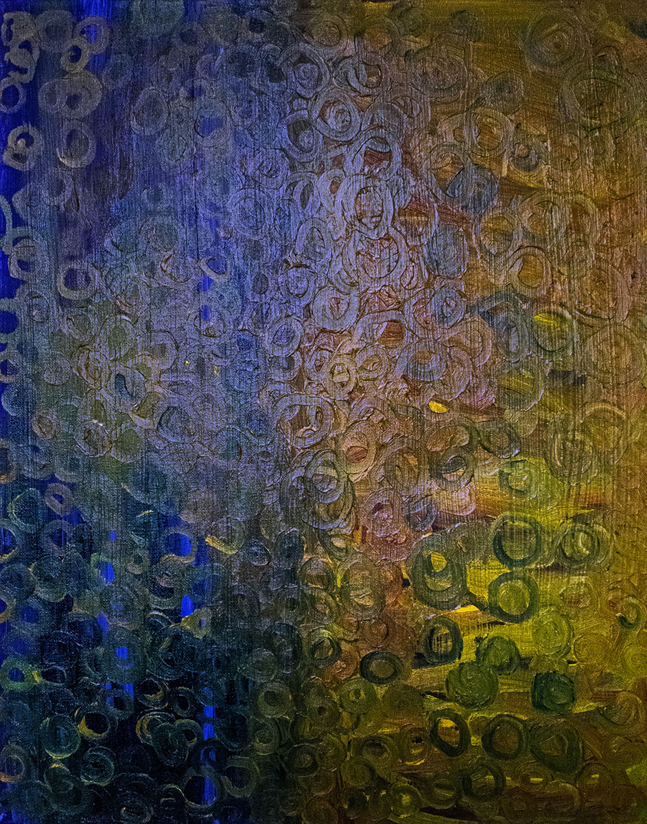
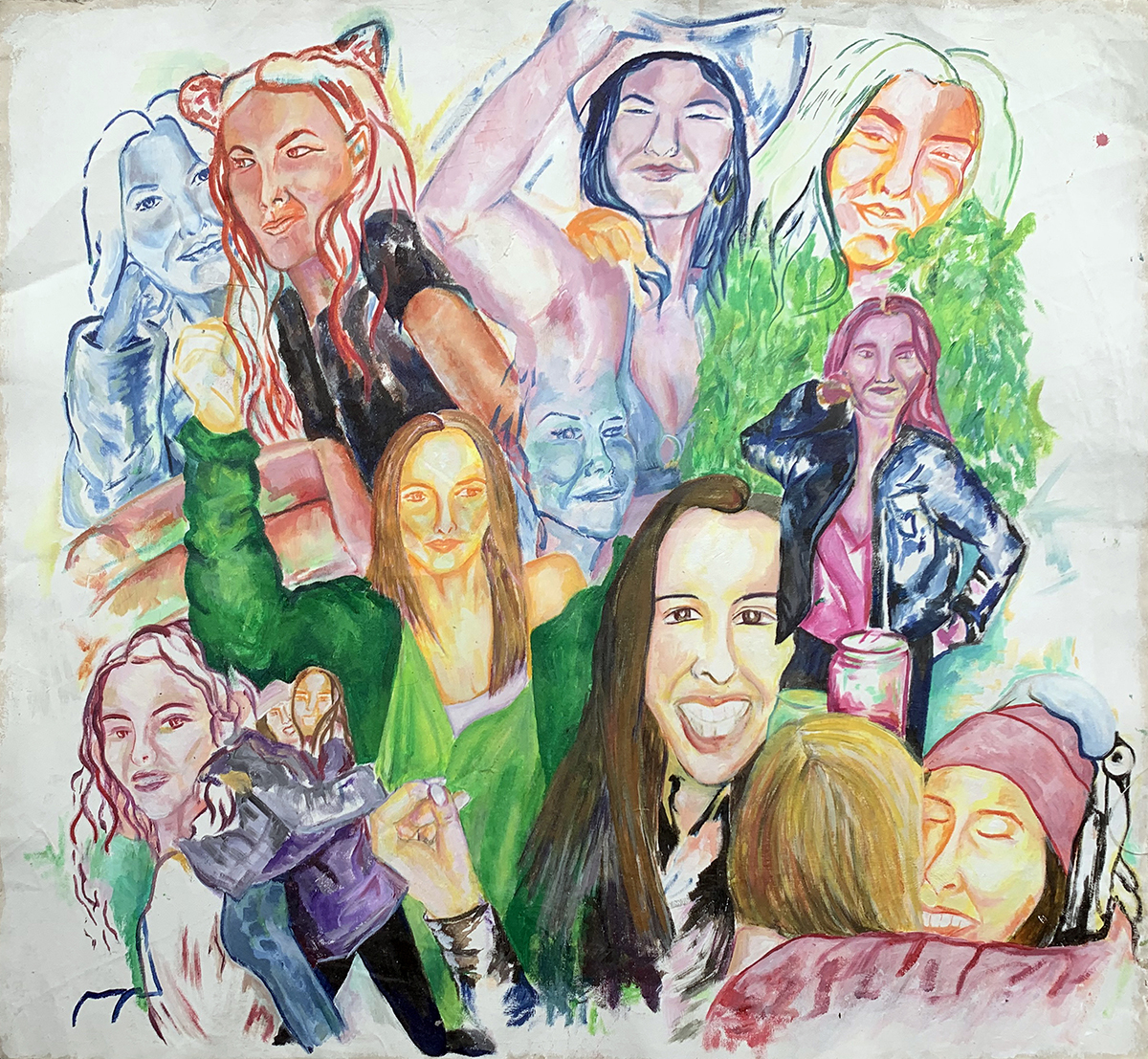
Liz Collins
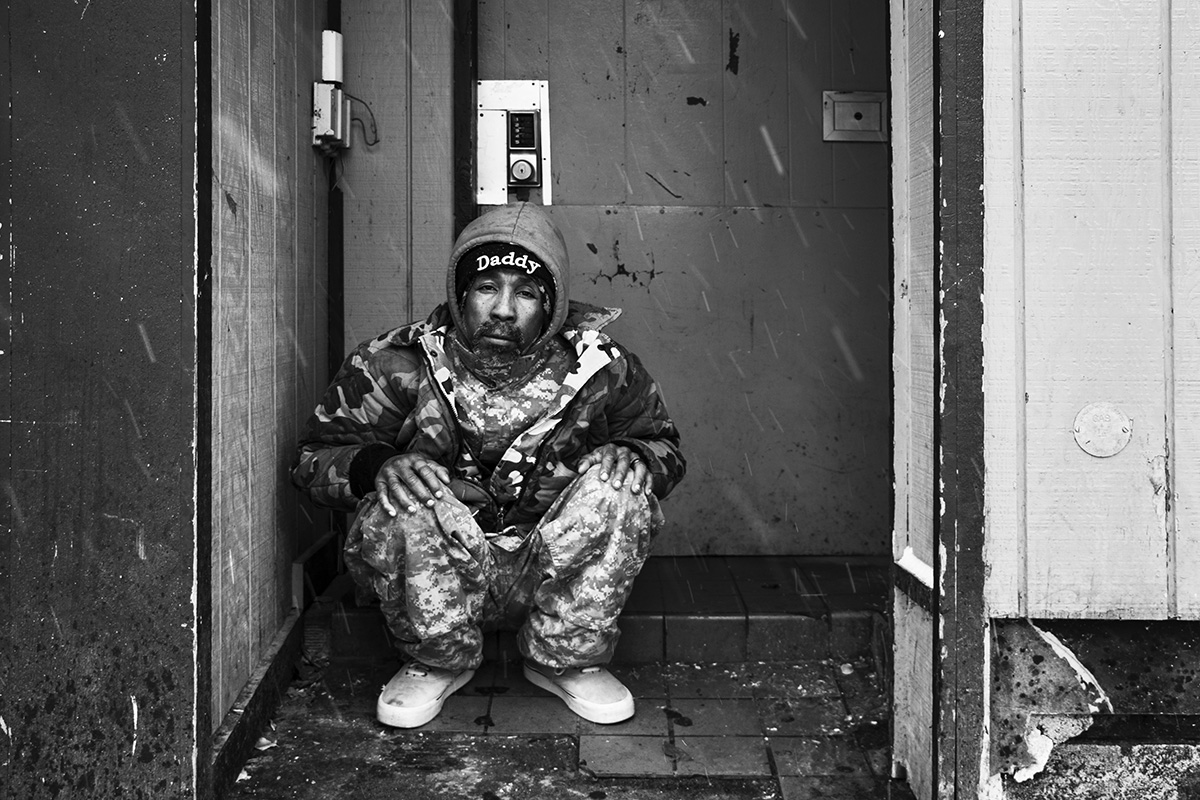
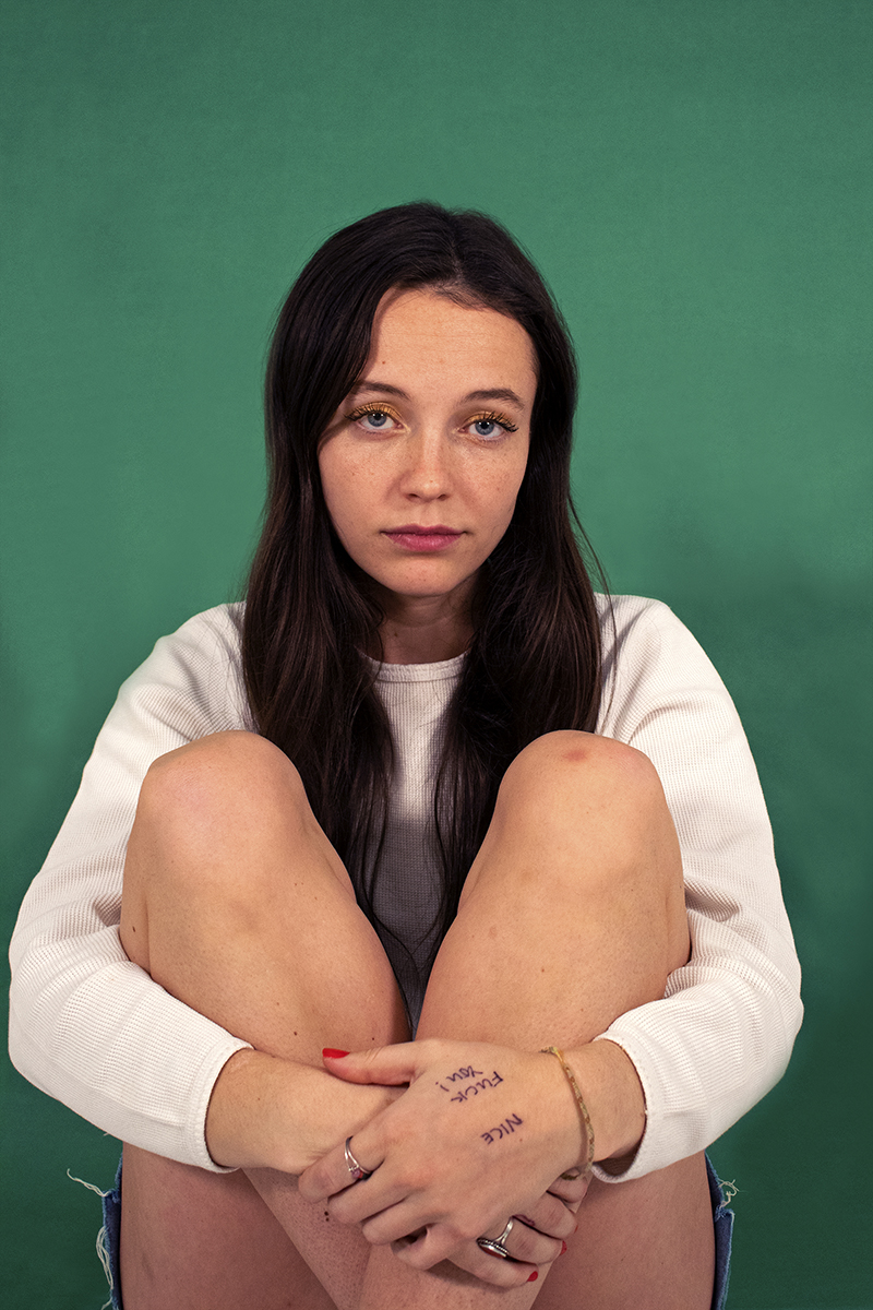
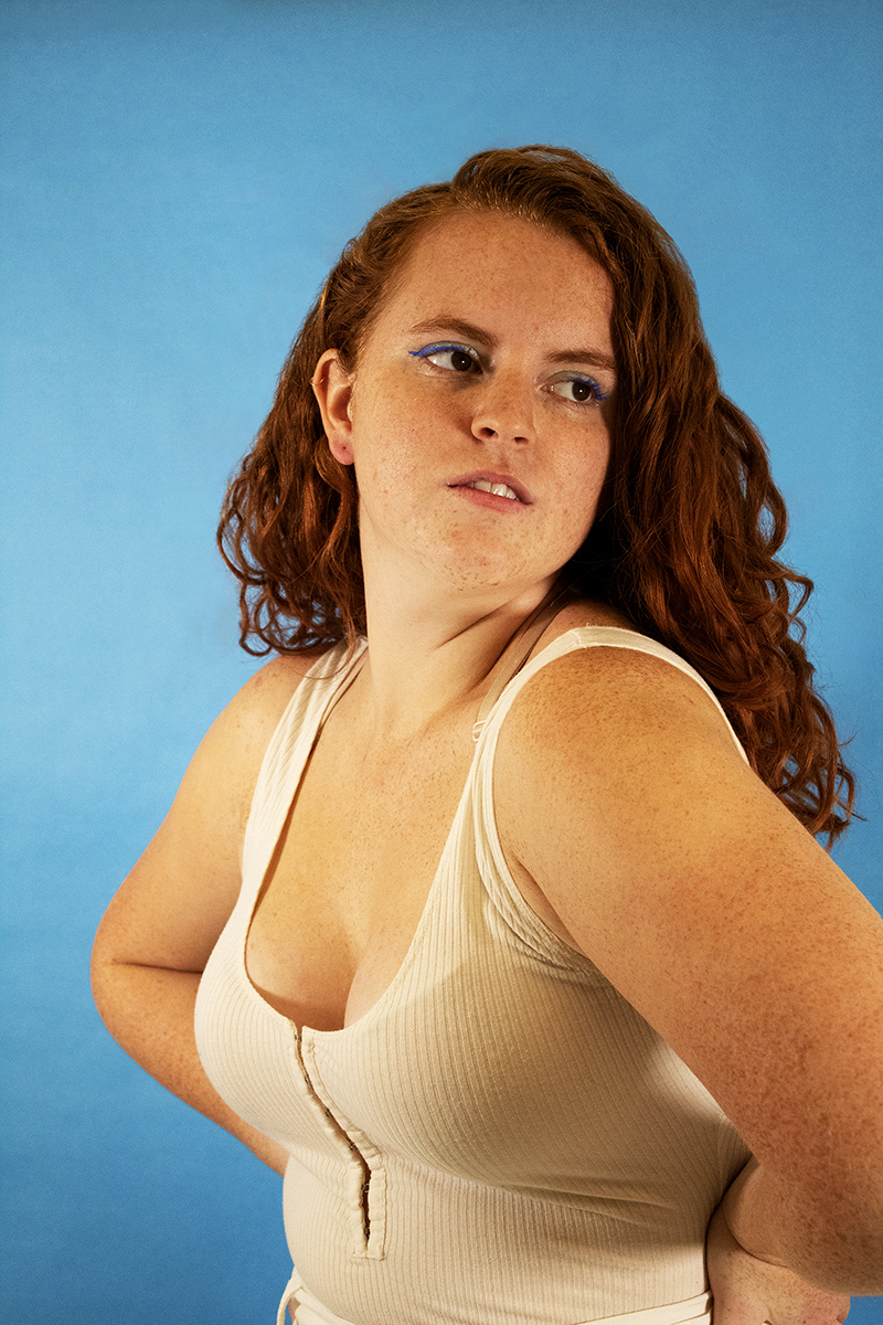
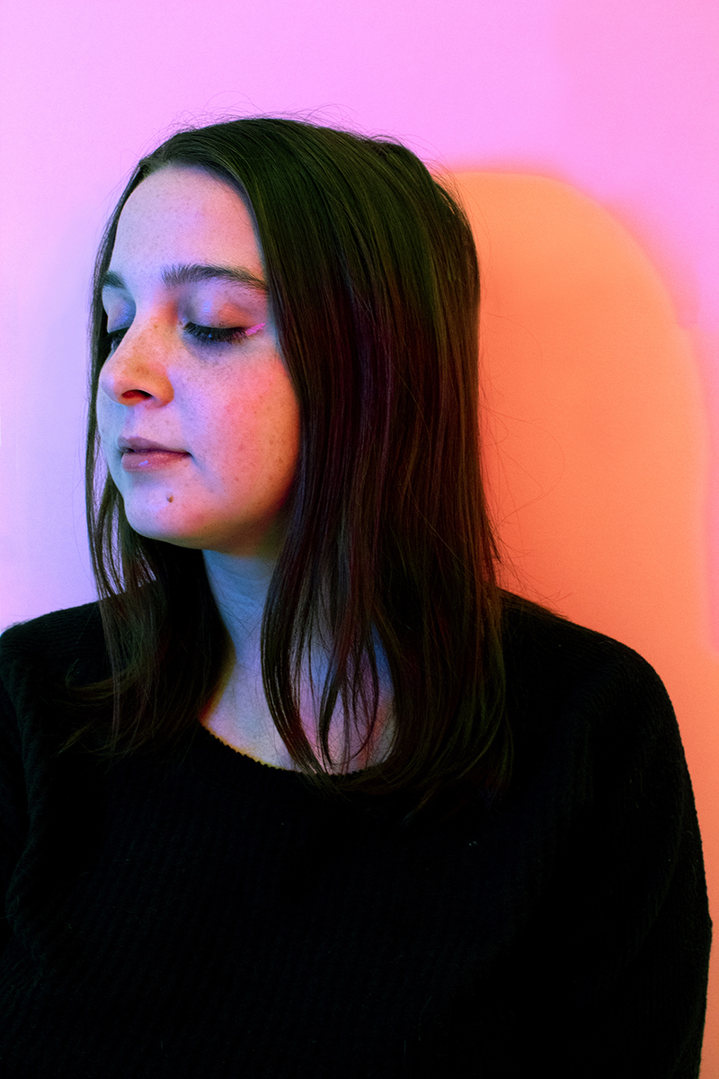
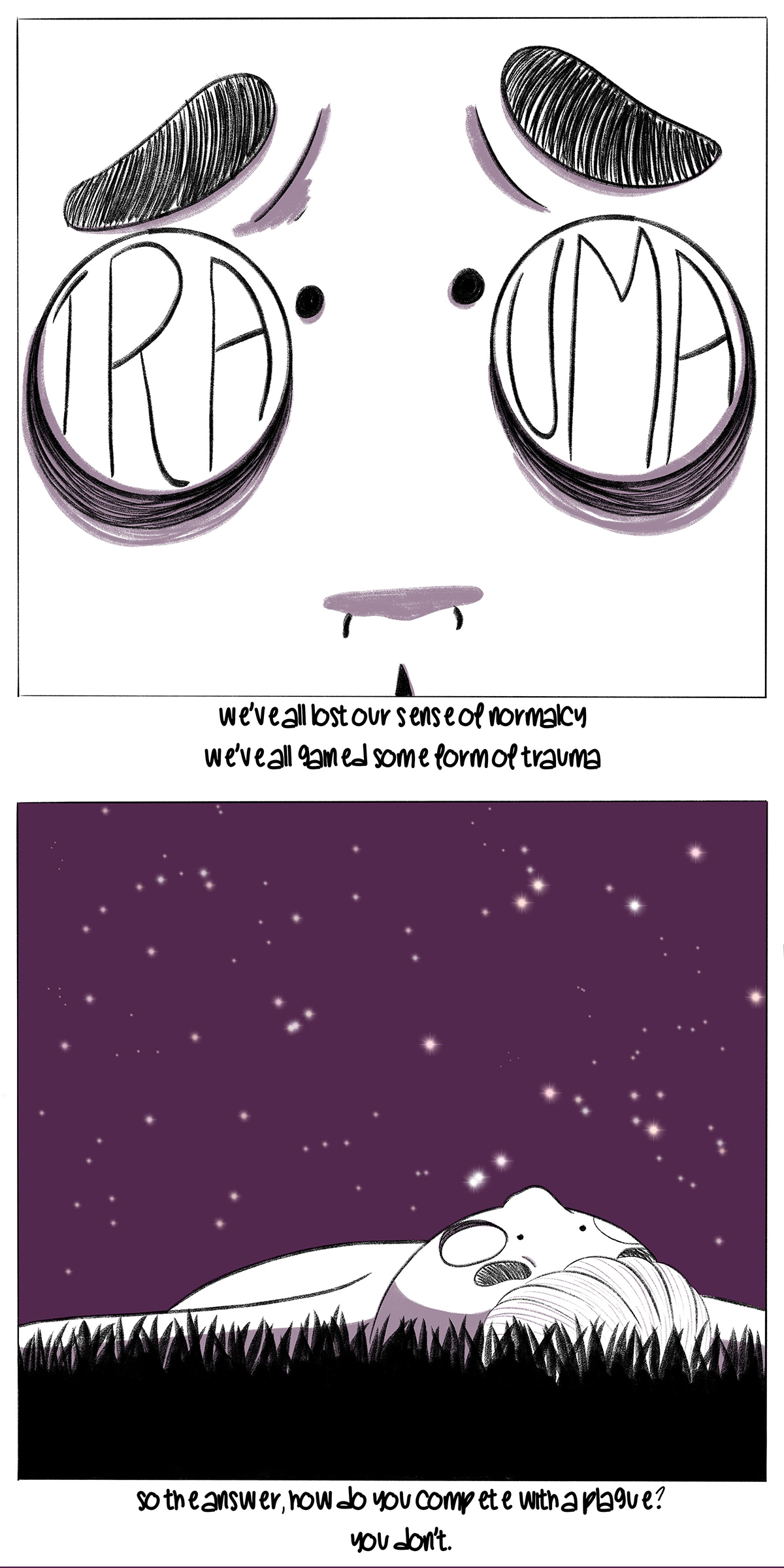
Color is everywhere, it makes up each of our realities as we know it. “What’s your favorite color?” is a question we’ve all been asked. Some argue that your favorite color reflects who you are as a person. The same color can also have different connotations that are dependent on one’s upbringing, gender, location, values, and a variety of other factors.
As a child, “What is your favorite color?” was a question I took very seriously. Even though there is no wrong answer, I didn’t want to claim a color as being my favorite, if I wasn’t sure. While perceptions of different hues are somewhat subjective, there are some effects that have universal meaning. Warm colors include hues of red, orange, and yellow that are known to evoke emotions ranging from feelings of warmth and comfort to feelings of anger and hostility. Cool colors include blue, purple, and green. They are often described as being calm, but can also call to mind feelings of sadness or indifference.
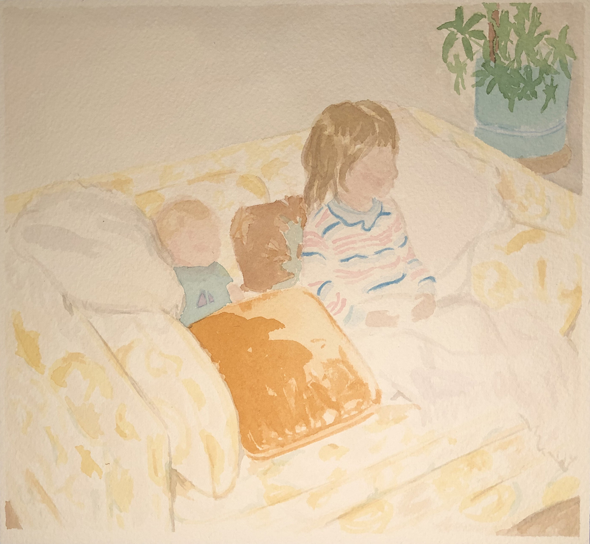
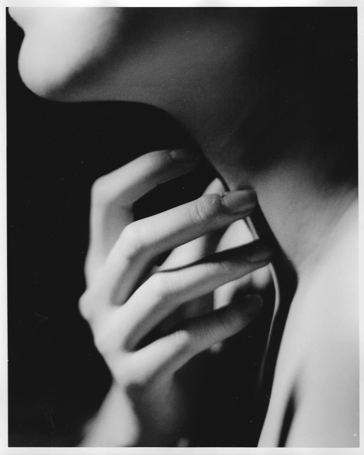
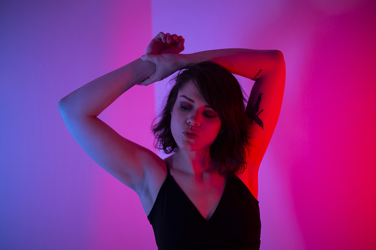
In the coloUr project, I chose to photograph both myself and some of my friends for a series of portraits. I worked in a small all white studio. I appreciate the intimacy this controlled room provides for me to focus on my relationship with the person I am photographing, and at times my relationship with myself. The white walls provide a sort of blank canvas, an opportunity to play with whatever colors I see fit to explore the close relationships I have with people.
My concept for initially selecting color was on physical features, interests, and personal connection with the person. I photographed my friends with their favorite color, and others with their least favorite color. Through this process, I have used color to reflect upon relationships with some of those closest to me, as well as with myself.
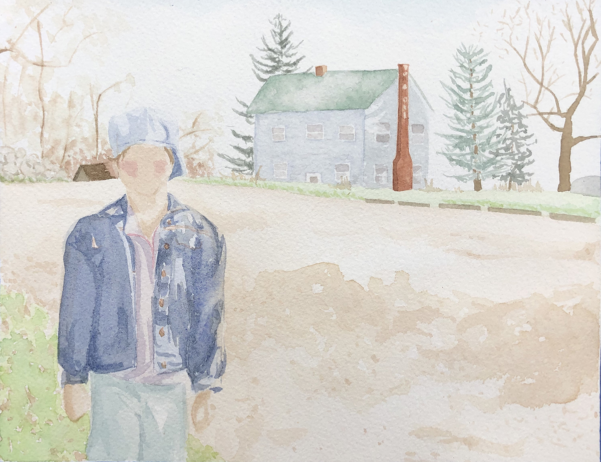
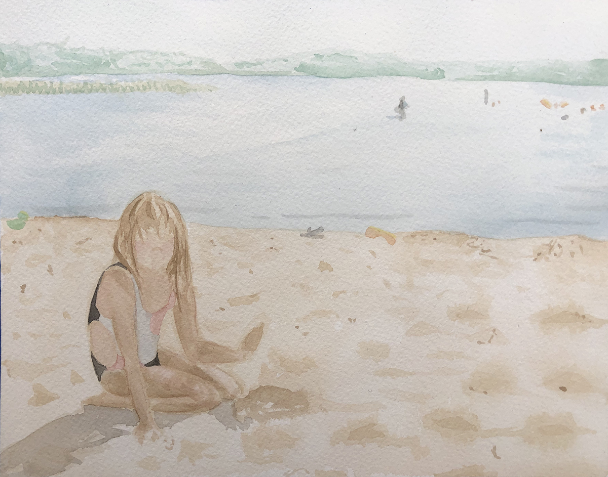
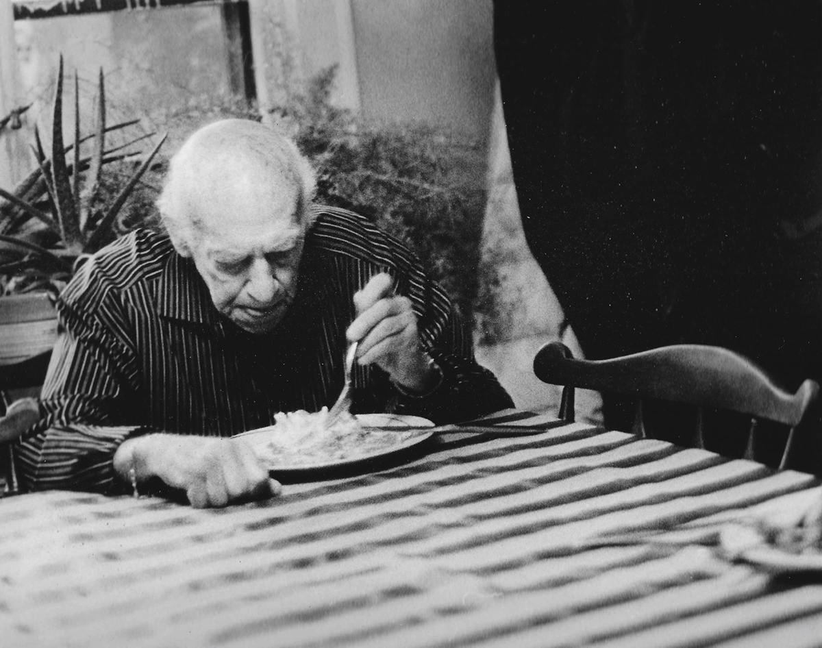
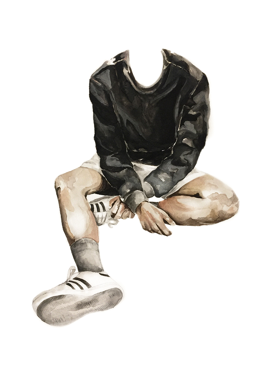
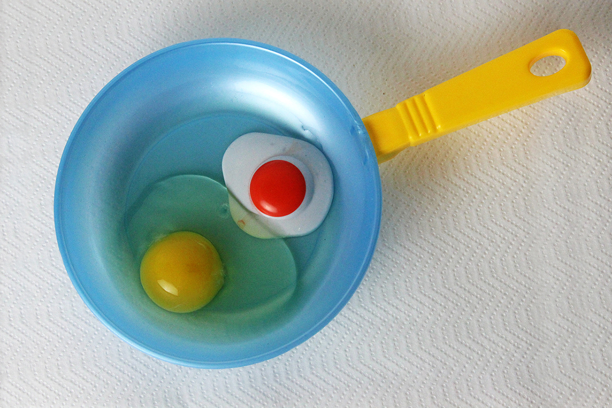
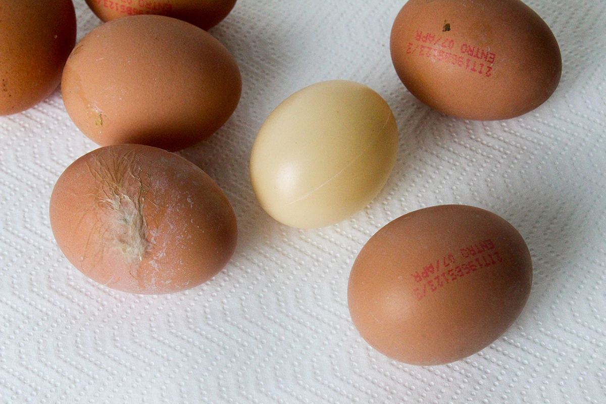
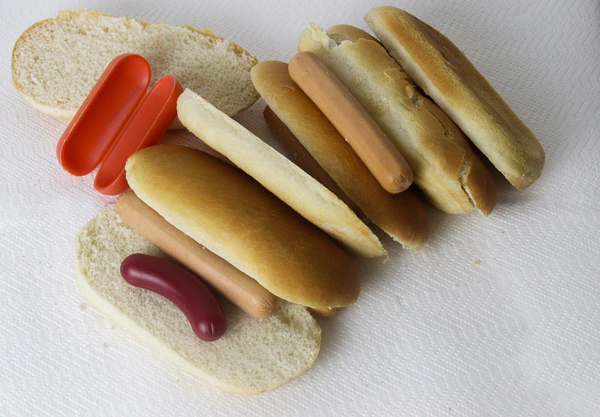
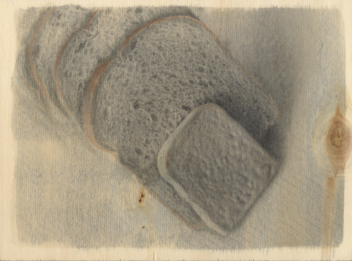
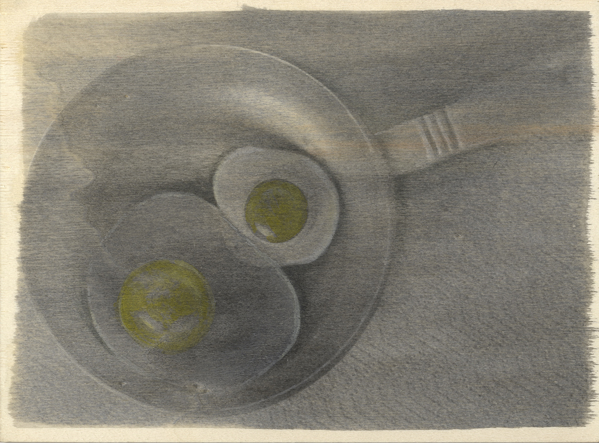
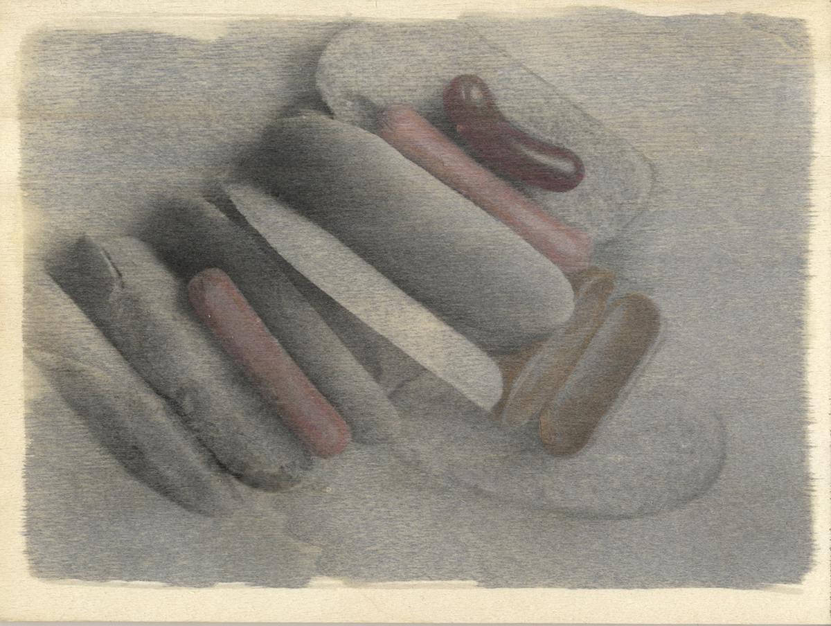
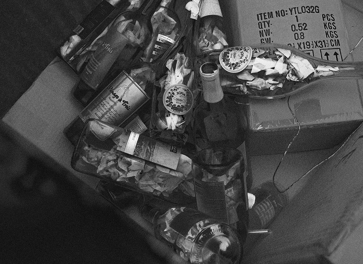
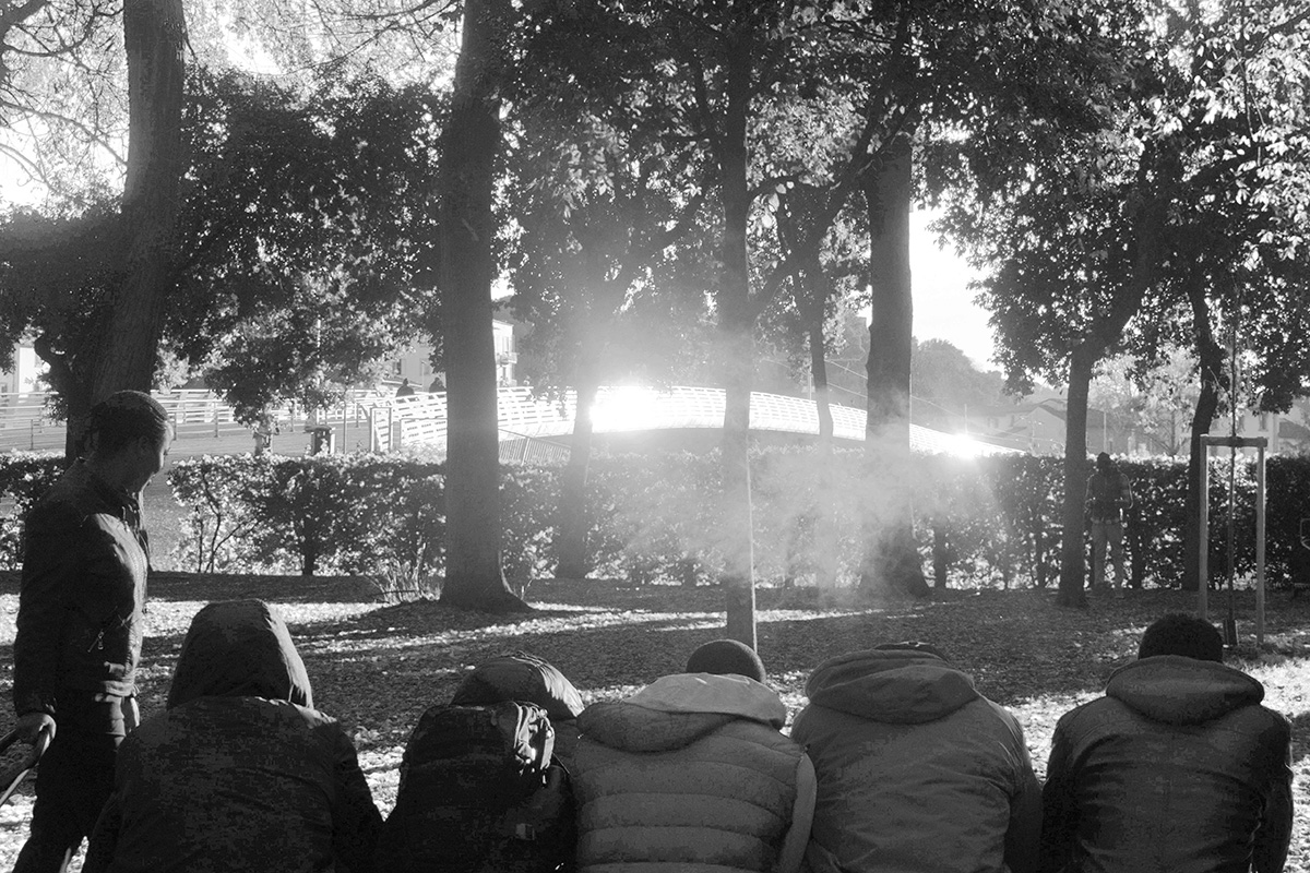
The series titled Preservatives are photographs that I took while studying in Florence, Italy. Living in a different country made me realize a lot of things about the country I grew up in, specifically when talking about the food. This series focuses on the amount of preservatives and random ingredients that go into the food that we eat here in America. One of my professors while studying told me that, “in Italy there is no such thing as ‘organic’ food, because everything is organic.” I placed plastic children’s toys shaped like different types of food next to the real thing to emphasize this contrast in quality.
In the second set, I used an alternative photography printing process where I applied liquid emulsion to wood, exposed with an enlarger, and then continued to process as normal in the dark room. After completing these steps, I added watercolor on top of the images of food to add an aspect of color to each piece.


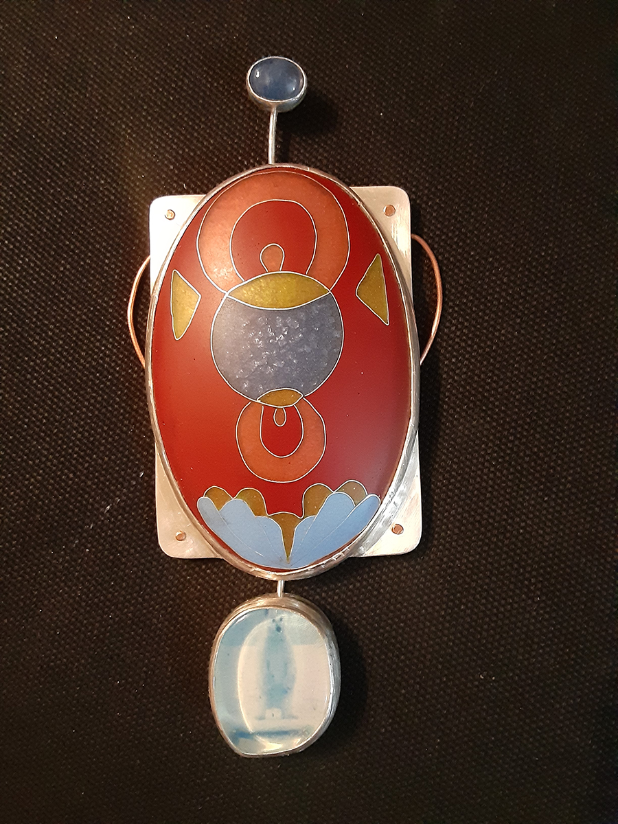


Hao Tan
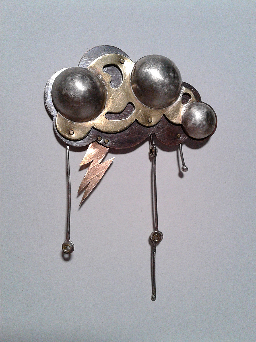
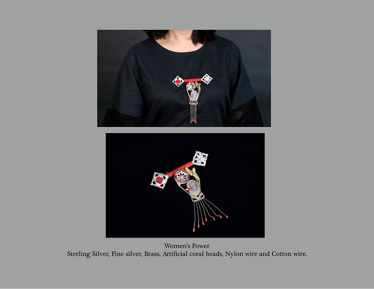
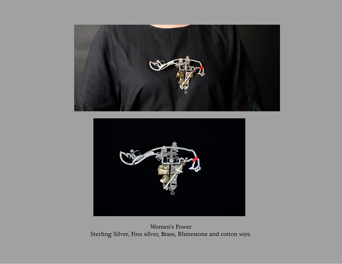
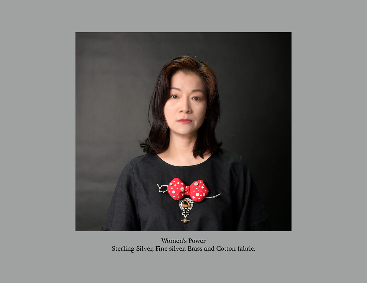
I have the strong desire to tell women how brilliant they are and awaken more women to envisioning their power and rights among the society, visualizing women’s contributions to this world is my starting point. The Women’s Power series contain three brooches, each size is around 6.3 to 7-inches. The basic shape of the brooches is a uterus, where life begins. As a jewelry designer, I used silver and copper as the main material to commend women’s endeavors. The three brooches present the different jobs of women in different classes from different times. The first two compare the roles of common and aristocratic women in the feudal era. Wheat, filature, and embryo represent the farming, weaving, and baking that symbolize the jobs of common women. The crown, money, and castle symbolize the power, wealth, and status of aristocrat women. The third brooch is a medal of honor, which commends the modern women’s contributions to this world, including science, medicine, biology, and so on. Beyond this, modern women also make a significant contributions to promoting equal rights. I hope all women can break the limitations made by sociality and themselves, so that they can do everything they wish and be anyone they want to be.